Transforming Healthcare Investments: Branding Strategies for a New York Hedge Fund
Background
In New York, hedge funds often find themselves competing for attention amidst a sea of investment opportunities. Lewis and Co.'s focus on healthcare companies positions it in a growing but competitive market. The synergy between finance and healthcare creates a compelling narrative that can attract both investors and partners, who are increasingly seeking responsible investment opportunities.
In order to carve out a niche in these dual arenas, the hedge fund needed a brand that resonated with both investors and healthcare providers. A strong brand identity would not only differentiate the fund from its competitors but also showcase the firm as a knowledgeable partner ready to navigate the intricate financial landscape while enhancing the quality of care.
Solution
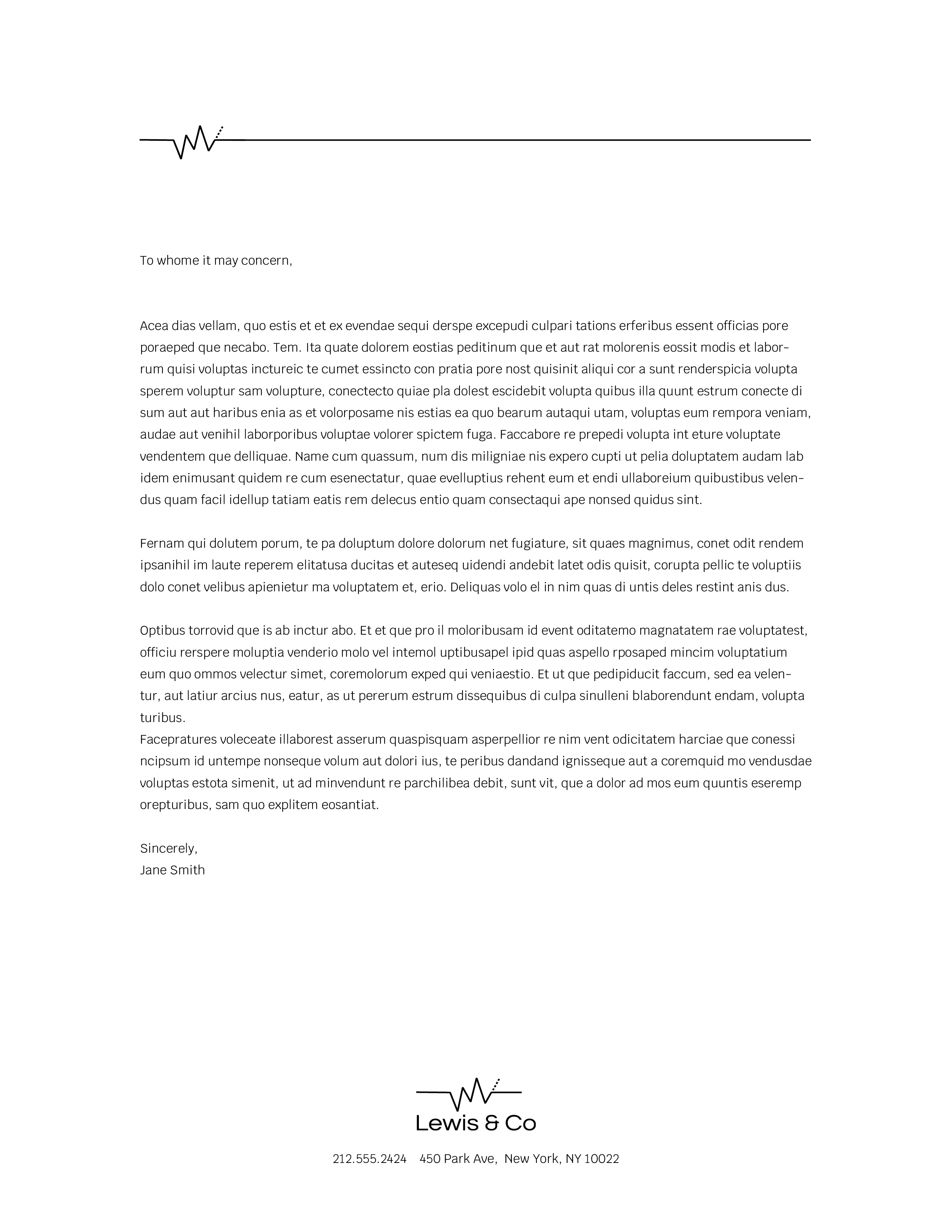
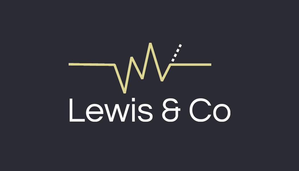
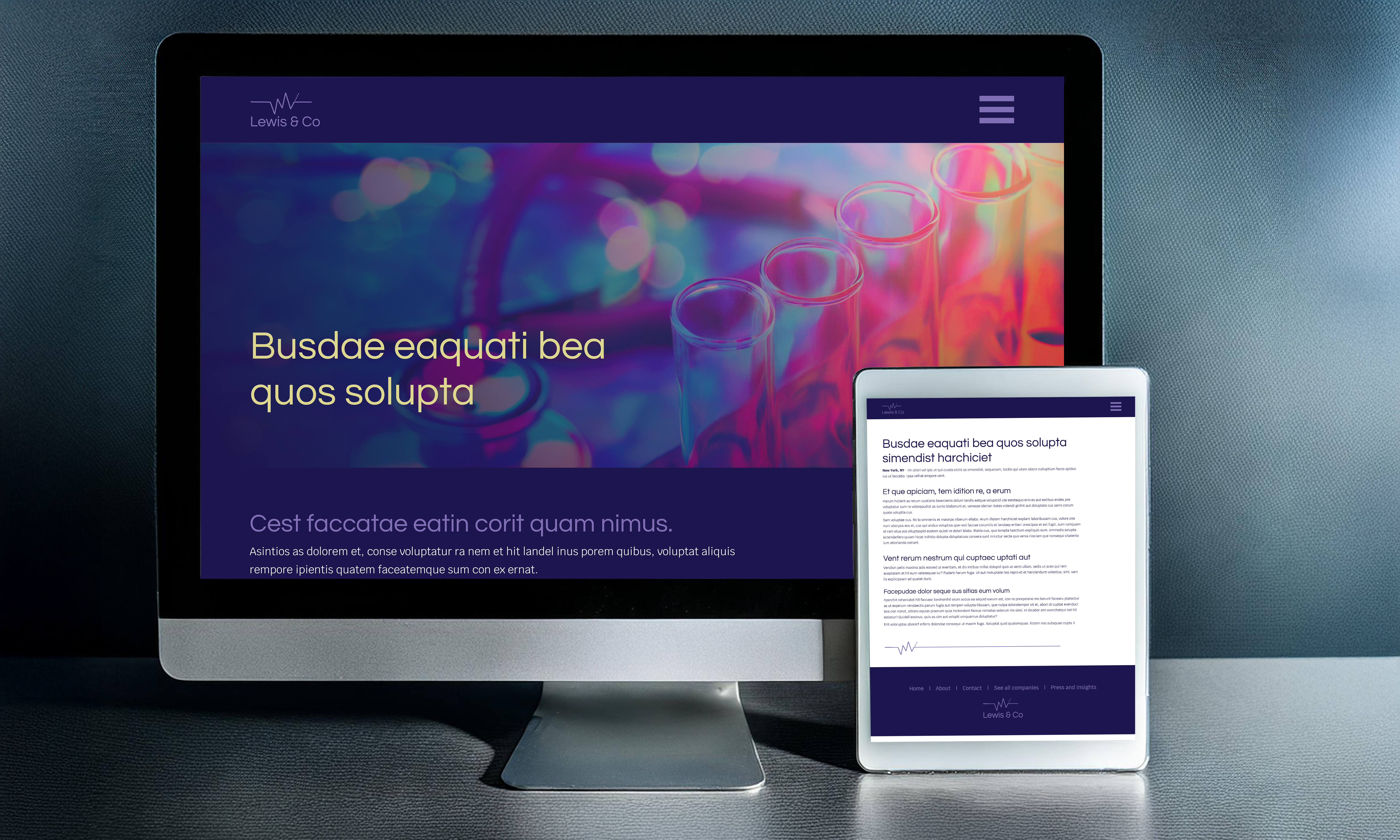
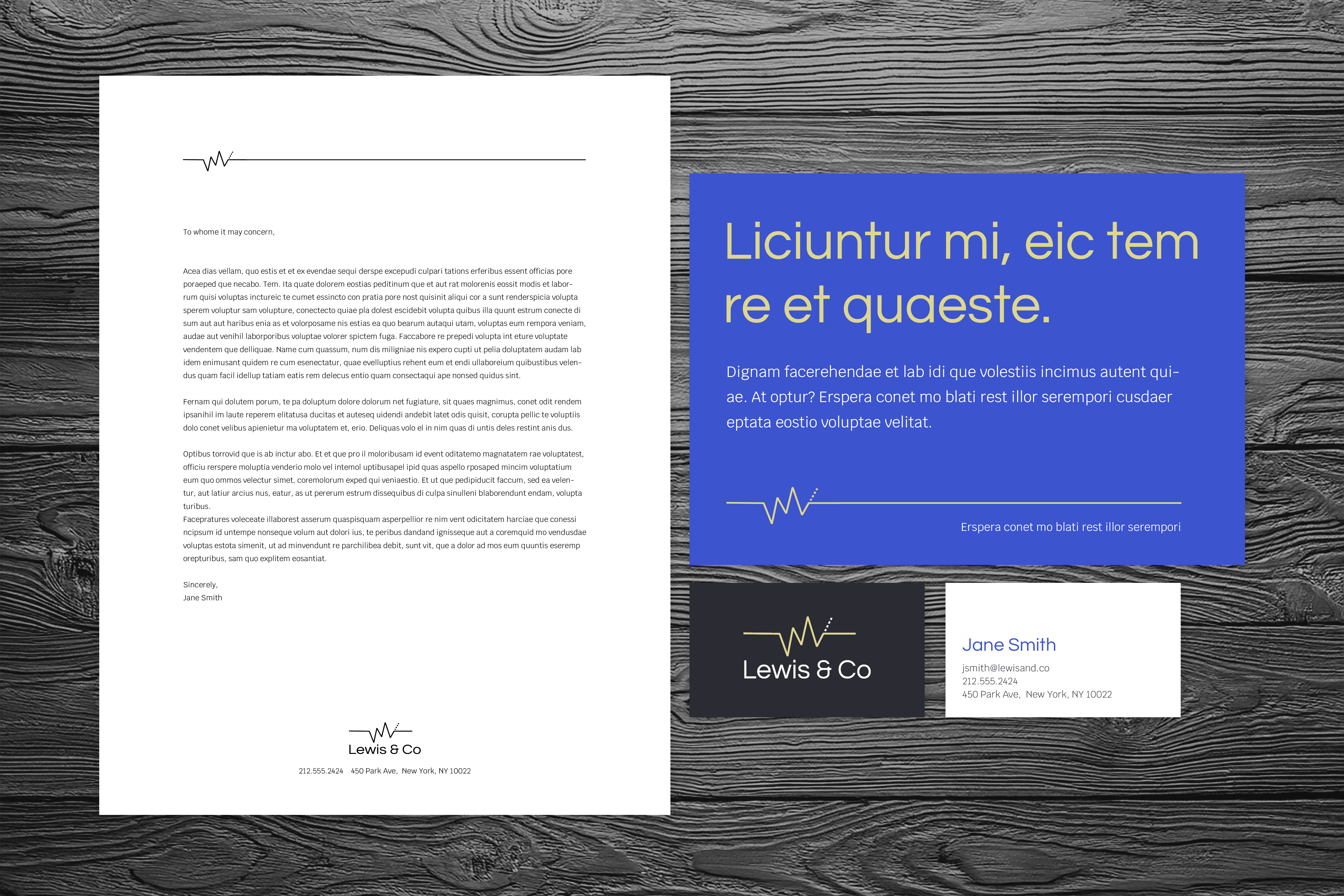
The logo incorporates elements that represent both finance and healthcare to create a unique visual identity that speaks to the duality of these sectors. The mark alludes to a financial graph which can symbolize growth, stability, and progress, which are essential qualities for any financial institution. At the same time, the reference to an EKG machine evokes a sense of care and vigilance, essential characteristics in the healthcare industry. This duality effectively communicates the brand's commitment to monitoring and supporting its clients' financial well-being.
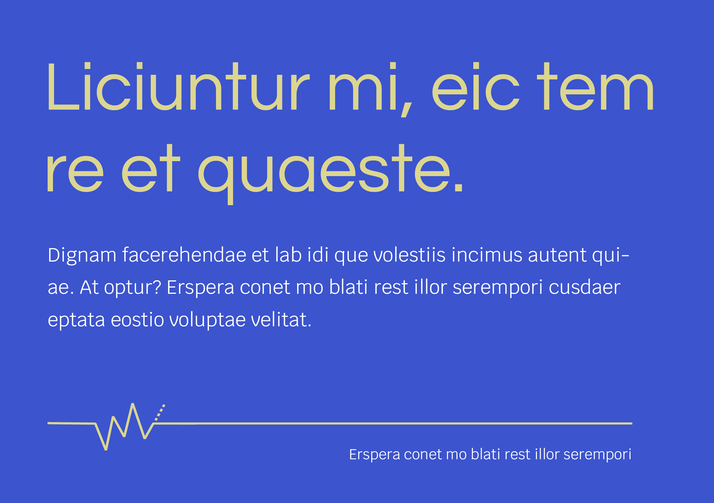
Bright, bold colors are conventional in the healthcare industry. A saturated palette was selected to ensure that Lewis and Co. can achieve visibility in that space. A typeface was selected that strikes a balance between legibility, professionalism, and the brand value of friendliness to ensure brand interactions are characterized by feelings of empathy, understanding, approachability, and transparency.
