Branding solutions for a Manhattan law firm

Background
In the competitive New York landscape of legal services, a full-service Manhattan law firm needed to differentiate itself from the crowd. The branding system needed to reflect the firm's values, expertise, and dedication to client success, creating an image that instilled trust and confidence in its capabilities.
Solution
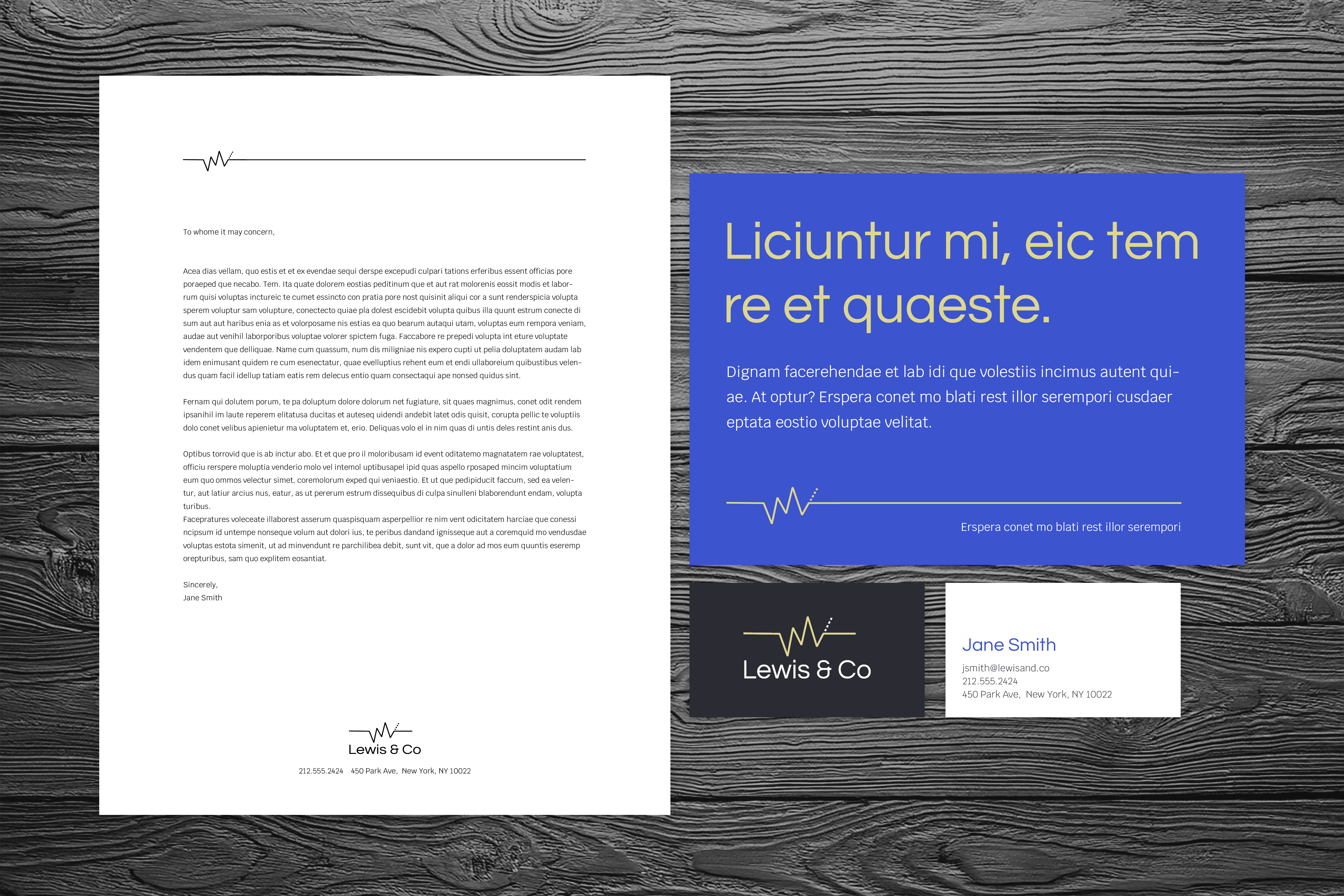
The type logo serves as a visual anchor, grounding the brand in industry convention while simultaneously projecting an image of strength. The logo communicates a balance of tradition with modernity and fosters a sense of trust.
In reimagining typography for a traditional legal brand, the designer took the opportunity to bridge the gap between established norms and contemporary expectations. This thoughtful evolution encourages a sense of accessibility and approachability, which is essential in an industry often perceived as rigid and formal. A professional and contemporary color system also plays a crucial role in shaping the overall perception of the brand. This palette not only retains the professionalism expected in the legal industry but signals a willingness to embrace current trends.
This contemporary approach not only enhances brand recognition but also positions the firm as a forward-thinking entity that values both its heritage and its future.


